Container
Container allows to decorate a control with background color and border and position it with padding, margin and alignment.
Examples
Clickable container
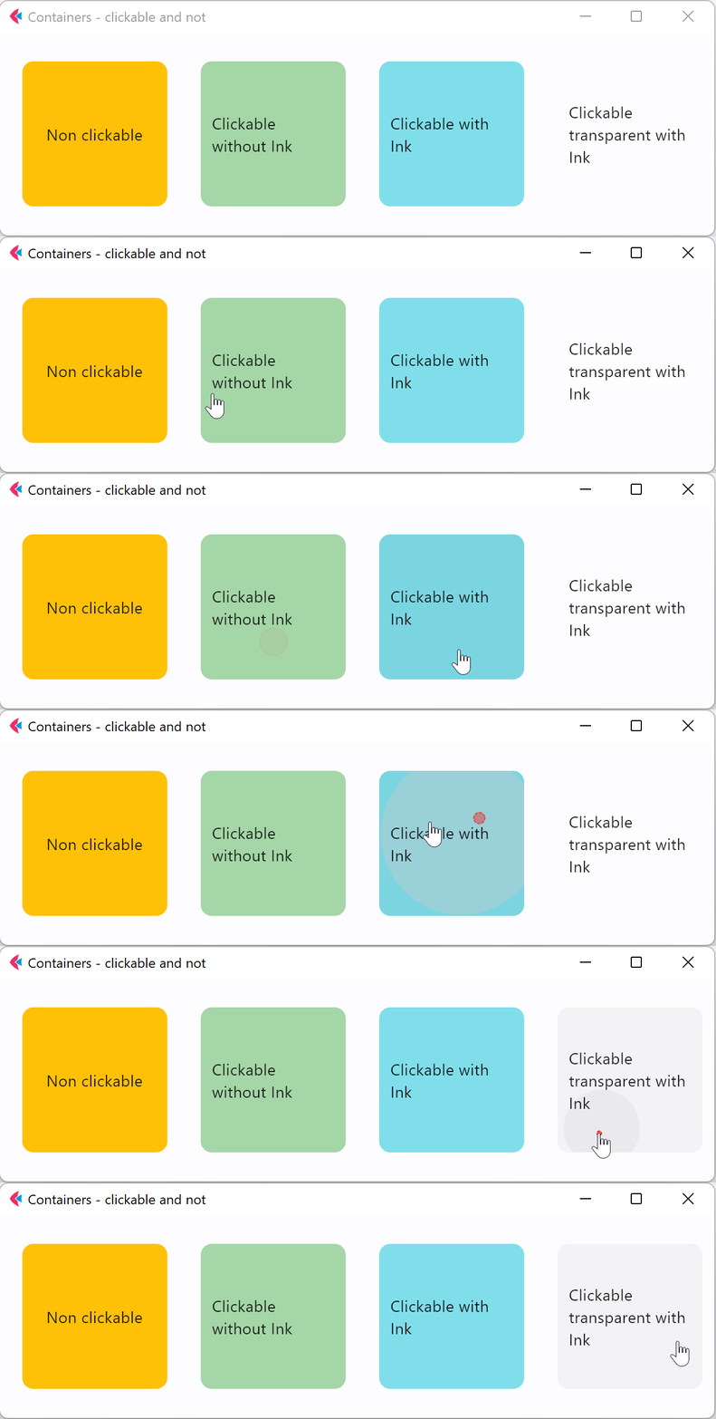
- Python
import flet as ft

def main(page: ft.Page):
    page.title = "Containers - clickable and not"
    page.vertical_alignment = ft.MainAxisAlignment.CENTER
    page.horizontal_alignment = ft.CrossAxisAlignment.CENTER

    page.add(
        ft.Row(
            [
                ft.Container(
                    content=ft.Text("Non clickable"),
                    margin=10,
                    padding=10,
                    alignment=ft.alignment.center,
                    bgcolor=ft.colors.AMBER,
                    width=150,
                    height=150,
                    border_radius=10,
                ),
                ft.Container(
                    content=ft.Text("Clickable without Ink"),
                    margin=10,
                    padding=10,
                    alignment=ft.alignment.center,
                    bgcolor=ft.colors.GREEN_200,
                    width=150,
                    height=150,
                    border_radius=10,
                    on_click=lambda e: print("Clickable without Ink clicked!"),
                ),
                ft.Container(
                    content=ft.Text("Clickable with Ink"),
                    margin=10,
                    padding=10,
                    alignment=ft.alignment.center,
                    bgcolor=ft.colors.CYAN_200,
                    width=150,
                    height=150,
                    border_radius=10,
                    ink=True,
                    on_click=lambda e: print("Clickable with Ink clicked!"),
                ),
                ft.Container(
                    content=ft.Text("Clickable transparent with Ink"),
                    margin=10,
                    padding=10,
                    alignment=ft.alignment.center,
                    width=150,
                    height=150,
                    border_radius=10,
                    ink=True,
                    on_click=lambda e: print("Clickable transparent with Ink clicked!"),
                ),
            ],
            alignment=ft.MainAxisAlignment.CENTER,
        ),
    )

ft.app(target=main)
Properties
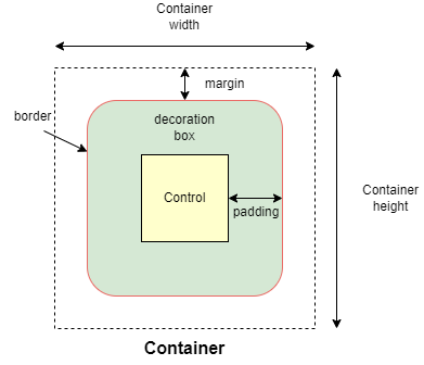
alignment
Align the child control within the container.
Alignment is an instance of alignment.Alignment class.
animate
Enables container "implicit" animation that gradually changes its values over a period of time.
The value is of AnimationValue type.
bgcolor
Defines the background color of the container.
blend_mode
The blend mode applied to the color or gradient background of the container. Property value is BlendMode enum with MODULATE as default.
blur
Applies Gaussian blur effect under the container.
The value of this property could be one of the following:
- a number - specifies the same value for horizontal and vertical sigmas, e.g.
10. - a tuple - specifies separate values for horizontal and vertical sigmas, e.g.
(10, 1). - an instance of
Blur
For example:
ft.Stack(
    [
        ft.Container(
            content=ft.Text("Hello"),
            image_src="https://picsum.photos/100/100",
            width=100,
            height=100,
        ),
        ft.Container(
            width=50,
            height=50,
            blur=10,
            bgcolor="#44CCCC00",
        ),
        ft.Container(
            width=50,
            height=50,
            left=10,
            top=60,
            blur=(0, 10),
        ),
        ft.Container(
            top=10,
            left=60,
            blur=ft.Blur(10, 0, ft.BlurTileMode.MIRROR),
            width=50,
            height=50,
            bgcolor="#44CCCCCC",
            border=ft.border.all(2, ft.colors.BLACK),
        ),
    ]
)
border
A border to draw above the background color.
Value is of type Border.
border_radius
If specified, the corners of the container are rounded by this radius.
Value is of type BorderRadius.
clip_behavior
The content will be clipped (or not) according to this option.
Value is of type ClipBehavior and defaults to ClipBehavior.ANTI_ALIAS
if border_radius is not None; otherwise ClipBehavior.HARD_EDGE.
color_filter
Applies a color filter to the container.
Value is of type ColorFilter.
content
A child Control contained by the container.
gradient
Configures gradient background. Value can be of type:
image_fit
How to inscribe the image into the space allocated during layout.
Value is of type ImageFit and defaults to ImageFit.NONE.
image_opacity
Sets image opacity when blending with a background.
Value ranges between 0.0(fully transparent) and 1.0(fully opaque).
image_repeat
How to paint any portions of the layout bounds not covered by the image.
Value is of type ImageRepeat and defaults to ImageRepeat.NO_REPEAT.
image_src
Sets an image as a container background. See Image.src for more details.
image_src_base64
Sets an image encoded as Base-64 string as a container background. See Image.src_base64 for more details.
ink
True to produce ink ripples effect when user clicks the container.
Defaults to False.
ink_color
The splash color of the ink response.
margin
Empty space to surround the decoration and child control.
Value is of type Margin class or a number.
padding
Empty space to inscribe inside a container decoration (background, border). The child control is placed inside this padding.
Value is of type Padding or a number.
rtl
True to set text direction to right-to-left.
Defaults to False.
shadow
Shadows cast by the container.
Value is of type BoxShadow or a List[BoxShadow].
shape
Sets the shape of the container.
Value is of type BoxShape and defaults to BoxShape.RECTANGLE.
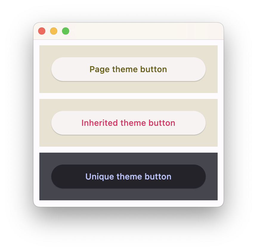
theme_mode
Setting theme_mode "resets" parent theme and creates a new, unique scheme for all controls inside the container. Otherwise the styles defined in container's theme property override corresponding styles from the parent, inherited theme.
Value is of type ThemeMode and defaults to ThemeMode.SYSTEM.
theme
Allows setting a nested theme for all controls inside the container and down the tree.
Value is of type Theme class.
Usage example
import flet as ft

def main(page: ft.Page):
    # Yellow page theme with SYSTEM (default) mode
    page.theme = ft.Theme(
        color_scheme_seed=ft.colors.YELLOW,
    )

    page.add(
        # Page theme
        ft.Container(
            content=ft.ElevatedButton("Page theme button"),
            bgcolor=ft.colors.SURFACE_VARIANT,
            padding=20,
            width=300,
        ),

        # Inherited theme with primary color overridden
        ft.Container(
            theme=ft.Theme(color_scheme=ft.ColorScheme(primary=ft.colors.PINK)),
            content=ft.ElevatedButton("Inherited theme button"),
            bgcolor=ft.colors.SURFACE_VARIANT,
            padding=20,
            width=300,
        ),

        # Unique always DARK theme
        ft.Container(
            theme=ft.Theme(color_scheme_seed=ft.colors.INDIGO),
            theme_mode=ft.ThemeMode.DARK,
            content=ft.ElevatedButton("Unique theme button"),
            bgcolor=ft.colors.SURFACE_VARIANT,
            padding=20,
            width=300,
        ),
    )

ft.app(main)
url
The URL to open when the container is clicked. If provided, on_click event is fired after that.
url_target
Where to open URL in the web mode.
Value is of type UrlTarget and defaults to UrlTarget.BLANK.
Events
on_click
Fires when a user clicks the container. Will not be fired on long press.
on_hover
Fires when a mouse pointer enters or exists the container area. data property of event object contains true (string) when cursor enters and false when it exits.
A simple example of a container changing its background color on mouse hover:
import flet as ft

def main(page: ft.Page):
    def on_hover(e):
        e.control.bgcolor = "blue" if e.data == "true" else "red"
        e.control.update()

    page.add(
        ft.Container(width=100, height=100, bgcolor="red", ink=False, on_hover=on_hover)
    )

ft.app(target=main)
on_long_press
Fires when the container is long-pressed.
on_tap_down
Fires when a user clicks the container with or without a long press.
Event handler argument is of type ContainerTapEvent.
If ink is True, e will be plain ControlEvent with empty data instead of ContainerTapEvent.
A simple usage example:
import flet as ft

def main(page: ft.Page):
    page.vertical_alignment = ft.MainAxisAlignment.CENTER
    page.horizontal_alignment = ft.CrossAxisAlignment.CENTER

    def on_long_press(e):
        print("on long press")
        page.add(ft.Text("on_long_press triggered"))

    def on_click(e):
        print("on click")
        page.add(ft.Text("on_click triggered"))

    def on_tap_down(e: ft.ContainerTapEvent):
        print("on tap down", e.local_x, e.local_y)
        page.add(ft.Text("on_tap_down triggered"))

    c = ft.Container(
        bgcolor=ft.colors.RED,
        content=ft.Text("Test Long Press"),
        height=100,
        width=100,
        on_click=on_click,
        on_long_press=on_long_press,
        on_tap_down=on_tap_down,
    )

    page.add(c)

ft.app(target=main)