CupertinoAppBar
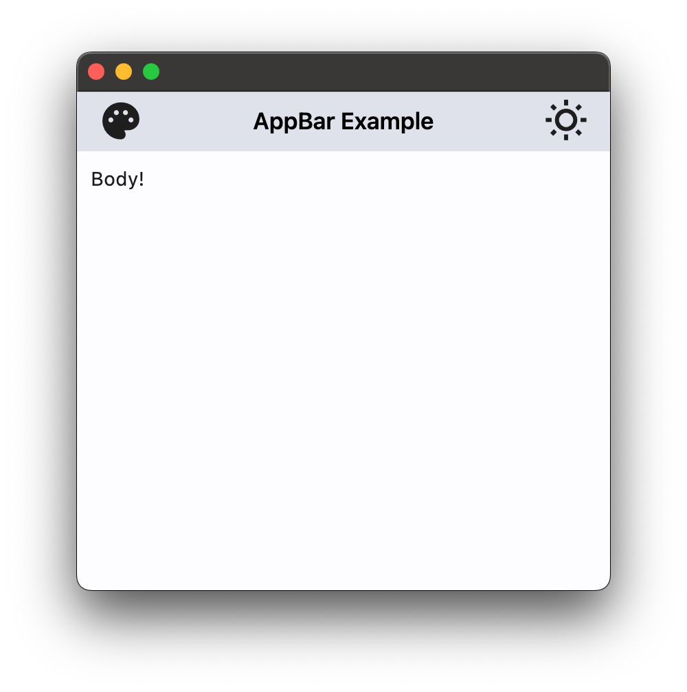
An iOS-styled application bar.
Examples
Basic Example
- Python
import flet as ft

def main(page: ft.Page):
    page.theme_mode = ft.ThemeMode.LIGHT

    page.appbar = ft.CupertinoAppBar(
        leading=ft.Icon(ft.icons.PALETTE),
        bgcolor=ft.colors.SURFACE_VARIANT,
        trailing=ft.Icon(ft.icons.WB_SUNNY_OUTLINED),
      middle=ft.Text("CupertinoAppBar Example"),
    )
    page.add(ft.Text("Body!"))


ft.app(target=main)
Properties
automatically_imply_leading
Controls whether we should try to imply the leading control if None.
If True and leading is null, automatically try to deduce what the leading widget should be.
If False and leading is None, leading space is given to title. If leading widget is not None, this parameter has no effect.
automatically_imply_middle
Controls whether we should try to imply the middle control if None.
If True and middle is null, automatically fill in a Text control with the current route's title. If middle control
is not None, this parameter has no effect.
bgcolor
The fill color to use for an AppBar. Default color is defined by current theme.
border
The border of the app bar. By default, a single pixel bottom border side is rendered.
Value is of type Border.
elevation
This property controls the size of the shadow below the app bar.
Defaults to 4.
leading
A Control to display at the start of this app bar. Typically the leading control is an Icon or an IconButton.
If None and automatically_imply_leading = True, an appropriate button will be automatically created.
middle
A Control to display in the middle of this app bar. Typically a Text or a segmented control.
padding
Defines the padding for the contents of the app bar.
Padding is an instance of Padding class.
If None, the app bar will adopt the following defaults:
- vertically, contents will be sized to the same height as the app bar itself minus the status bar.
- horizontally, padding will be
16pixels according to iOS specifications unless the leading widget is an automatically inserted back button, in which case the padding will be0.
Vertical padding won't change the height of the app bar.
trailing
A Control to place at the end of the app bar. Normally additional actions taken on the page such as a search or edit function.