NavigationBar
Material 3 Navigation Bar component.
Navigation bars offer a persistent and convenient way to switch between primary destinations in an app.
Examples
A simple NavigationBar
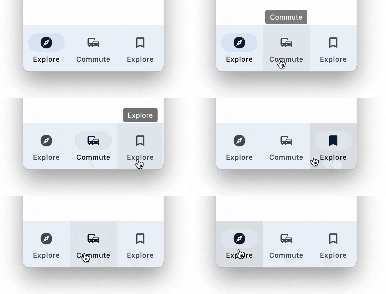
import flet as ft

def main(page: ft.Page):

    page.title = "NavigationBar Example"
    page.navigation_bar = ft.NavigationBar(
        destinations=[
            ft.NavigationBarDestination(icon=ft.icons.EXPLORE, label="Explore"),
            ft.NavigationBarDestination(icon=ft.icons.COMMUTE, label="Commute"),
            ft.NavigationBarDestination(
                icon=ft.icons.BOOKMARK_BORDER,
                selected_icon=ft.icons.BOOKMARK,
                label="Explore",
            ),
        ]
    )
    page.add(ft.Text("Body!"))

ft.app(target=main)
NavigationBar properties
adaptive
If the value is True, an adaptive NavigationBar is created based on whether the target platform is iOS/macOS.
On iOS and macOS, a CupertinoNavigationBar is created, which has matching functionality and presentation as NavigationBar, and the graphics as expected on iOS. On other platforms, a Material NavigationBar is created.
Defaults to False.
animation_duration
The transition time for each destination as it goes between selected and unselected.
bgcolor
The color of the navigation bar itself.
destinations
Defines the appearance of the button items that are arrayed within the navigation bar.
The value must be a list of two or more NavigationBarDestination instances.
elevation
The elevation of the navigation bar itself.
indicator_color
The color of the selected destination indicator.
indicator_shape
The shape of the selected destination indicator.
Value is of type OutlinedBorder.
label_behavior
Defines how the destinations' labels will be laid out and when they'll be displayed.
Can be used to show all labels, show only the selected label, or hide all labels.
Value is of type NavigationBarLabelBehavior and defaults
to NavigationBarLabelBehavior.ALWAYS_SHOW.
overlay_color
The highlight color of the NavigationDestination in various ControlState states.
The following ControlState values are supported: PRESSED, HOVERED and FOCUSED.
selected_index
The index into destinations for the current selected NavigationBarDestination or None if no destination is selected.
shadow_color
The color used for the drop shadow to indicate elevation.
surface_tint_color
The surface tint of the Material that holds the NavigationDrawer's contents.
NavigationBar events
on_change
Fires when selected destination changed.
NavigationBarDestination properties
bgcolor
The color of this destination.
icon
The name of the icon of the destination.
icon_content
The icon Control of the destination. Used instead of icon property.
Typically an Icon control.
If selected_icon_content is provided, this will only be displayed when the destination is not selected.
To make the NavigationBar more accessible, consider choosing an icon with a stroked and filled version, such as icons.CLOUD and icons.CLOUD_QUEUE. The icon should be set to the stroked version and selected_icon to the filled version.
label
The text label that appears below the icon of this NavigationBarDestination.
selected_icon
The name of alternative icon displayed when this destination is selected.
selected_icon_content
An alternative icon Control displayed when this destination is selected.
If this icon is not provided, the NavigationBar will display icon_content in either state.